Websites Like Apple: 12 Product Sites That Scroll Like apple.com, Taken Apart
Quick answer. Websites like Apple share one move: the product is the hero and your scroll is the remote control. Sticky sections hold the product still while video or 3D changes around it. Sonos, DJI and Ultrahuman do it closest to Apple right now. Rivian still uses Apple's old canvas method. Apple itself now runs on video, with no canvas on the three product pages we measured in November 2026.
Which one are you? The list is the same. The next step is not.
- Building this for your own product. Skip to what it costs, then send us the product and the deadline on WhatsApp. You get a fixed number back within 24 hours, not a range. Prefer email? Get your price here.
- Agency or freelancer with a client who wants the Apple look. We build the scroll part white-label, fixed price, on your timeline. You keep the client and the credit. Send the brief and the number comes back within 24 hours.
- Collecting references. Good. Bookmark it. The side-by-side table and how Apple actually builds it are the parts worth saving.
Search for websites like Apple and you mostly get template shops and the same five Dribbble shots. Fine if you want a theme. Useless if you want to know why apple.com feels the way it does, and what it takes to build that for your own product.
So we did it the slow way. On 10 November 2026 we loaded every site below in desktop Chrome, scrolled it top to bottom, and recorded the technique, the libraries, the page weight and how many videos and canvases it runs. Then we did the same to Apple. That second part changed the guide.
Free, and from a human
What would an Apple-style page for your product cost?
Send me your site or your product page. I read it myself and reply within 24 hours with a fixed price, what I'd build first, and whether it's worth doing at all. If a scroll story won't move your numbers, I'll say so and you keep the plan.
Got it. A confirmation is on its way to your inbox, and your price follows within 24 hours, from me. Rather talk it through? Book 15 minutes →
No call needed. Builds start at $3,000 and usually take 2 to 4 weeks. Streets of Punk and Nugget Nation are two of ours.
Websites like Apple at a glance
| Site | Category | Apple technique | On load | Full scroll | Screens | Sticky elements | Stack signal | The move to steal |
|---|---|---|---|---|---|---|---|---|
| Sonos Arc Ultra | Audio | Sticky story under a pinned buy bar | 9.6 MB | 25.2 MB | 28 | 14 | Next.js, 1 canvas, 7 videos | Price first, film second |
| Ember | Smart home | Full-bleed video hero, quiet chapters | 8.0 MB | 9.0 MB | 10.7 | 2 | Shopify, 7 videos, no canvas | Film the result, not the gadget |
| Ultrahuman Ring | Wearable | One small object, one light, smoothed scroll | 3.9 MB | 5.0 MB | 13.3 | 3 | Next.js, GSAP, Lenis, 2D canvases | Give a tiny product a whole stage |
| Meta AI glasses | Wearable | Full-screen lifestyle video, sticky price bar | 7.4 MB | 19.2 MB | 9.9 | 5 | No framework detected, 10 videos, no canvas | Show it worn, not floating |
| DJI Osmo Pocket 3 | Camera | Video chapters that load as you scroll | 8.7 MB | 39.4 MB | 29.9 | 5 | Next.js, 20 videos, no canvas | Load each clip only when its chapter arrives |
| Insta360 X4 | Camera | Long-form video page, 40+ clips | 4.3 MB | 67.9 MB | 44.1 | 9 | Next.js, 40+ videos, no canvas | Let the product's own footage be the page |
| Samsung Galaxy S25 Ultra | Phone | Apple's own playbook, used by its rival | 7.2 MB | 19.4 MB | 43.1 | 3 | No framework detected, 18 videos, a 3D viewer canvas | A sticky product bar with the price in it |
| Rivian R2 | Electric vehicle | 2D canvases, the setup behind Apple's 2019 frame sequences | 10.5 MB at 22 s | 53.2 MB | 32.9 | 1 | Next.js, 6 to 11 canvases, 16 videos | A masked video window inside the type |
| Cowboy | E-bike | Video hero, film that loads as you scroll | 3.2 MB | 64.4 MB | 20.9 | 3 | Shopify, 11 videos, no canvas | A three-proof strip under the hero |
| Playdate | Handheld console | Live Three.js model in the hero | 8.5 MB | 12.0 MB | 17.1 | 0 | Three.js, 2 WebGL canvases, 2 videos | A live model people can tell is live |
| Analogue Pocket | Handheld console | Huge stills, huge type, almost no motion | 40.0 MB | 40.0 MB | 29.8 | 2 | Next.js, 1 video, no canvas | Photography good enough to be the motion |
| Raycast | Software | Dark hero, one canvas, interface as product shot | 3.2 MB | 17.4 MB | 17.8 | 0 | Next.js, 1 canvas, no video | Render the interface like hardware |
12 websites like Apple, taken apart
Grouped by what they sell, not by technique. Every number comes from the live page, captured on 10 November 2026 at 1440 by 900. We record two weights: what loaded in the first eight seconds before any scrolling, and the total after scrolling to the bottom. They can differ by twenty times. Sites change, so treat the numbers as a snapshot.
Unless an entry says otherwise, an agency would quote $5,000 to $15,000 for a page like these. Our Flagship builds start at $3,000, usually 2 to 4 weeks.
1. Sonos Arc Ultra, audio
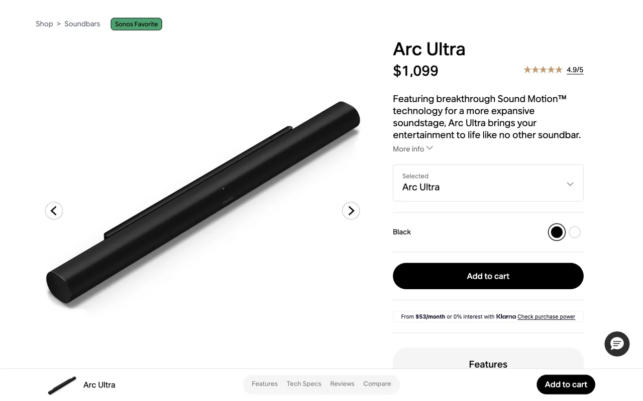
Stack: Next.js · 9.6 MB in the first 8 seconds, 25.2 MB over a full scroll · 28 screens of scroll · 7 video elements, 1 canvas, 14 sticky elements
Sonos built a shop page that turns into a launch page. The top is pure commerce: price, rating, colour, add to cart. Keep scrolling and it becomes an Apple chapter page, with 14 sticky elements, seven videos and one 2D canvas drawn at 1440 by 810.
The order is the clever part. Most brands make you sit through the film to find the price. Sonos puts the price first, the film second, and a slim add-to-cart bar follows you down all 28 screens. You are never more than one click from buying.
Steal this: Put the price and the button above the film and pin a slim buy bar to the bottom. The film is for people who are already interested.
2. Ember, smart home
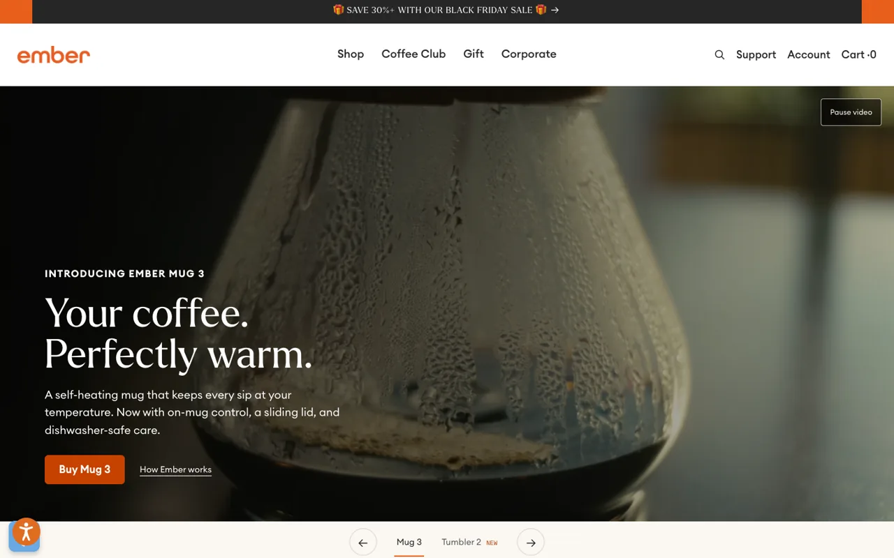
Stack: Shopify · 8.0 MB in the first 8 seconds, 9.0 MB over a full scroll · 10.7 screens of scroll · 7 video elements, 2 sticky elements
Ember sells a mug that keeps coffee warm, which is a hard thing to film. The hero solves it with one slow macro shot of a glass carafe beaded with condensation and four words: “Your coffee. Perfectly warm.” No 3D, no canvas. Seven videos across 10.7 screens and only 2 sticky elements.
This is the cheap end of the Apple look, and it works because the footage is good and the copy is short. It runs on Shopify, so the cart, the subscription and the Coffee Club sit on the same page as the film.
The price is weight: 8.0 MB in the first eight seconds, about half of it video.
Steal this: If your product does something you cannot see, film the result. One great shot beats a 3D model nobody asked for.
3. Ultrahuman Ring, wearable
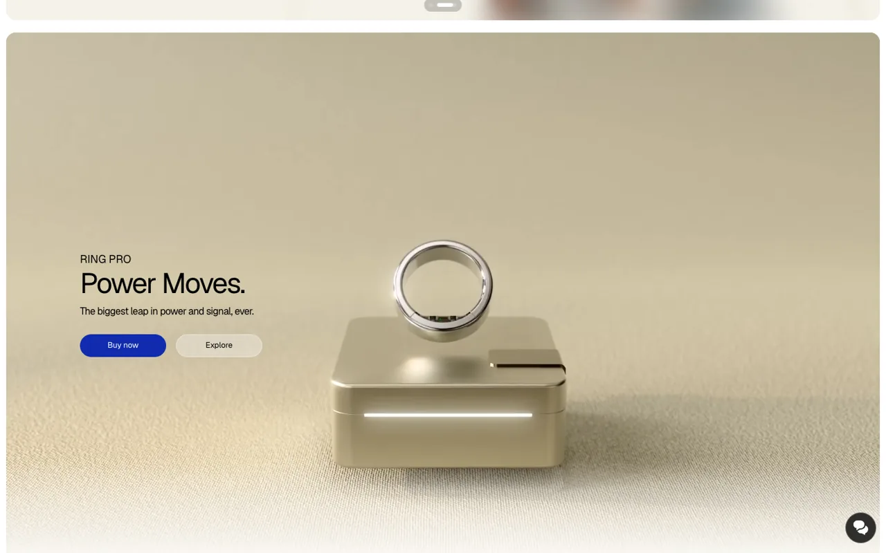
Stack: Next.js, GSAP, Lenis · 3.9 MB in the first 8 seconds, 5.0 MB over a full scroll · 13.3 screens of scroll · 4 video elements, 2 canvases, 3 sticky elements
Ultrahuman's homepage opens on a rotating promo carousel, the least Apple thing about it. Scroll one screen and it changes: Ring Pro floats above its charging dock on a soft beige set, with two words of headline and two buttons. In the wipe between sections sits a full-width 2D canvas with the class name arcShine. Lenis smooths the scroll and GSAP is in the source.
A ring is tiny. Apple's answer for small products is to give them the whole stage: one object, one light source, nothing else in frame. Ultrahuman does exactly that, then lets numbered science images carry the claims one screen at a time. All 3 sticky elements sit inside sections taller than the screen: the Apple sticky stage, by the book.
It has the lightest full scroll in this list: 5.0 MB, from 3.9 MB on load.
Steal this: Give a small product a whole screen, one light and nothing else. Then let one claim own each screen after it.
4. Meta AI glasses, wearable
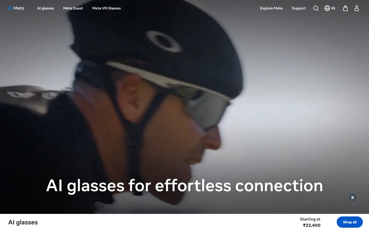
Stack: no framework detected · 7.4 MB in the first 8 seconds, 19.2 MB over a full scroll · 9.9 screens of scroll · 10 video elements, 5 sticky elements
Meta's AI glasses page flips Apple's approach. Apple shows AirPods floating in black space. Meta's hero is a tight, motion-blurred shot of a cyclist wearing the glasses at speed, with one line of type over it. Ten video elements, 5 sticky elements, under ten screens.
It is a useful counterexample. Glasses sell on how they look on a face, so the film is people, not renders. The starting price sits in a bar along the bottom from the first frame.
Steal this: If people wear it, show it worn. Save the floating product shots for the spec section.
5. DJI Osmo Pocket 3, camera
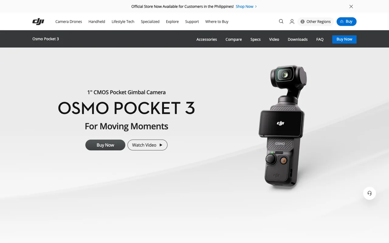
Stack: Next.js · 8.7 MB in the first 8 seconds, 39.4 MB over a full scroll · 29.9 screens of scroll · 20 video elements, 5 sticky elements
DJI's Osmo Pocket 3 page is the closest thing in this list to a current Apple page: 20 video elements across 29.9 screens and 5 sticky elements, most of them inside sections taller than the screen.
The hero is calm to the point of boring: a clean render on grey, the name, one line, two buttons. The motion is saved for the features, where it shows the gimbal doing its job.
Lazy loading is the lesson. The page weighs 8.7 MB in the first eight seconds and climbs to 39.4 MB by the end, so you only download the clips you actually reach.
Steal this: Start each clip when its section enters the screen and pause it when it leaves. Nobody needs twenty videos decoding at once.
6. Insta360 X4, camera
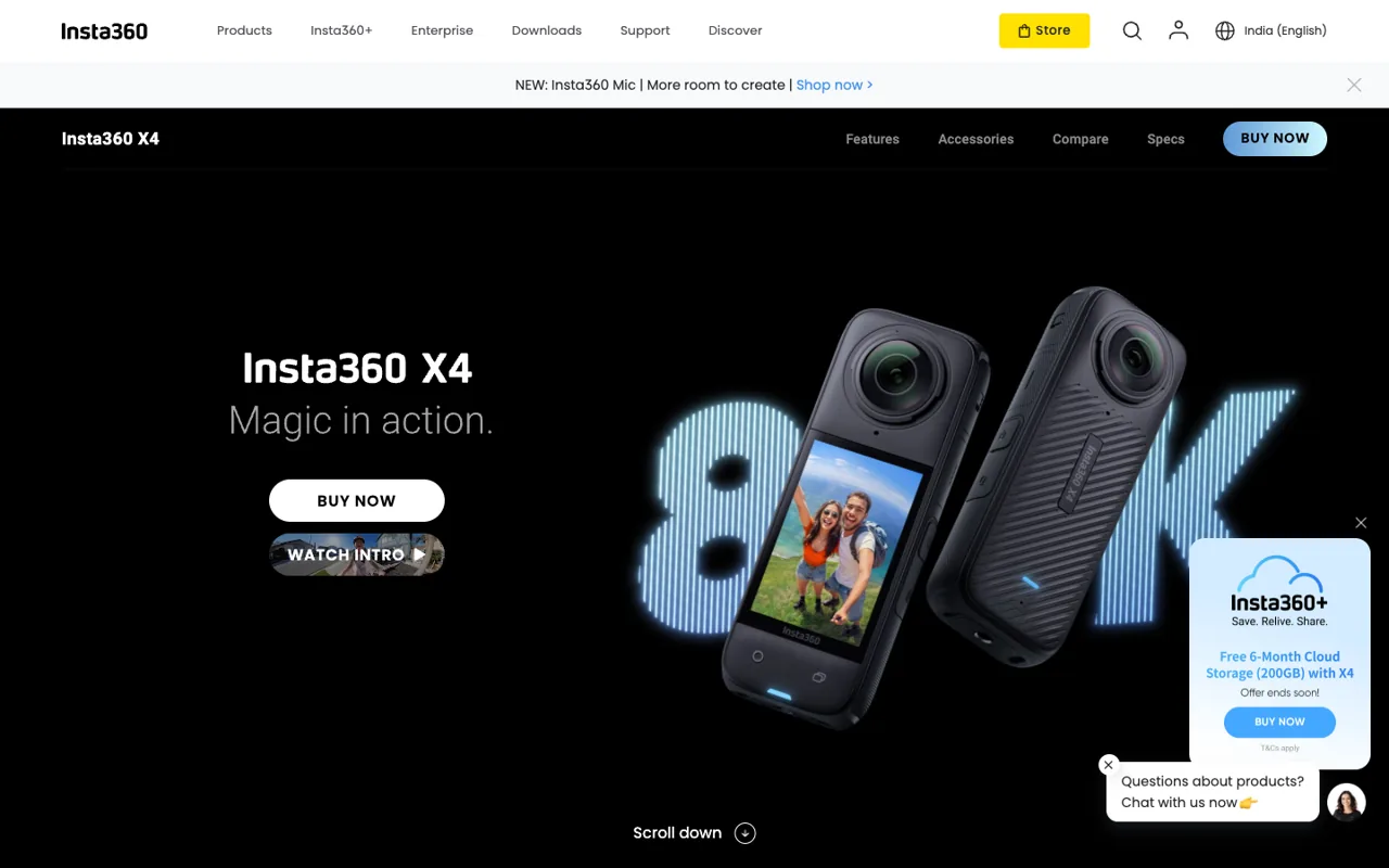
Stack: Next.js · 4.3 MB in the first 8 seconds, 67.9 MB over a full scroll · 44.1 screens of scroll · 40 video elements, 9 sticky elements · Agency band for a page like this: $5,000 to $15,000, plus footage
Insta360 X4 is the most extreme page here. 44.1 screens of scroll, 40 video elements on arrival and 44 by the bottom, 9 sticky elements and 67.9 MB moved over a full scroll. That is more than three times Apple's AirPods Pro page.
It mostly works because the product is a camera and the clips are what it shot. Each chapter proves one feature with real footage. A cloud-storage popup and a chat bubble fight it the whole way down.
This is where “make it like Apple” goes wrong. Apple edits. Insta360 includes everything.
Steal this: If your product makes content, build the page from that content. Then cut half the chapters.
Have a product, or just a question about this? You don't have to book a call. Message us. Ishan replies within 24 hours.
Something went wrong. WhatsApp us instead?
Got it. If you gave an email, a confirmation is already on its way and Ishan replies within 24 hours.
7. Samsung Galaxy S25 Ultra, phone
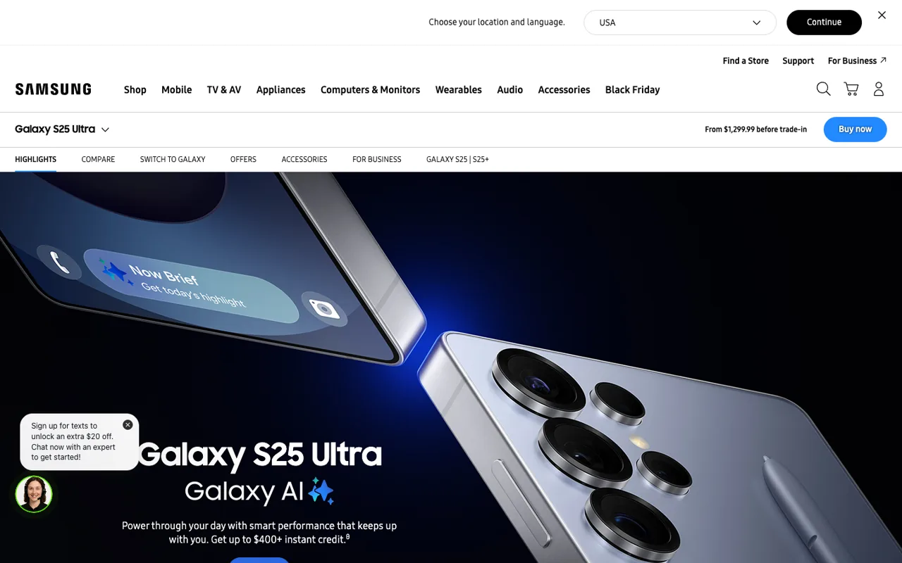
Stack: no framework detected · 7.2 MB in the first 8 seconds, 19.4 MB over a full scroll · 43.1 screens of scroll · 18 video elements, 1 canvas, 3 sticky elements · Agency band for a page like this: $5,000 to $15,000, plus the 3D viewer
Samsung's Galaxy S25 Ultra page has the most Apple-looking hero in the list, which is either flattering or awkward depending on who you ask. A dark hero, the phone at an angle with light raking across the titanium, a sticky product bar with the price and Buy now, and in-page tabs for Highlights, Compare, Switch to Galaxy and Offers.
Underneath: 43.1 screens, 18 video elements, 3 sticky elements and one canvas. That canvas is almost certainly the 3D viewer: its wrapper is called v3d-viewer. Then the difference shows. Visiting from outside the US, a location bar and a text-and-chat widget sit over the hero. Apple's page opens on the product.
Steal this: Copy the sticky product bar with the price in it. Skip the popups.
8. Rivian R2, electric vehicle
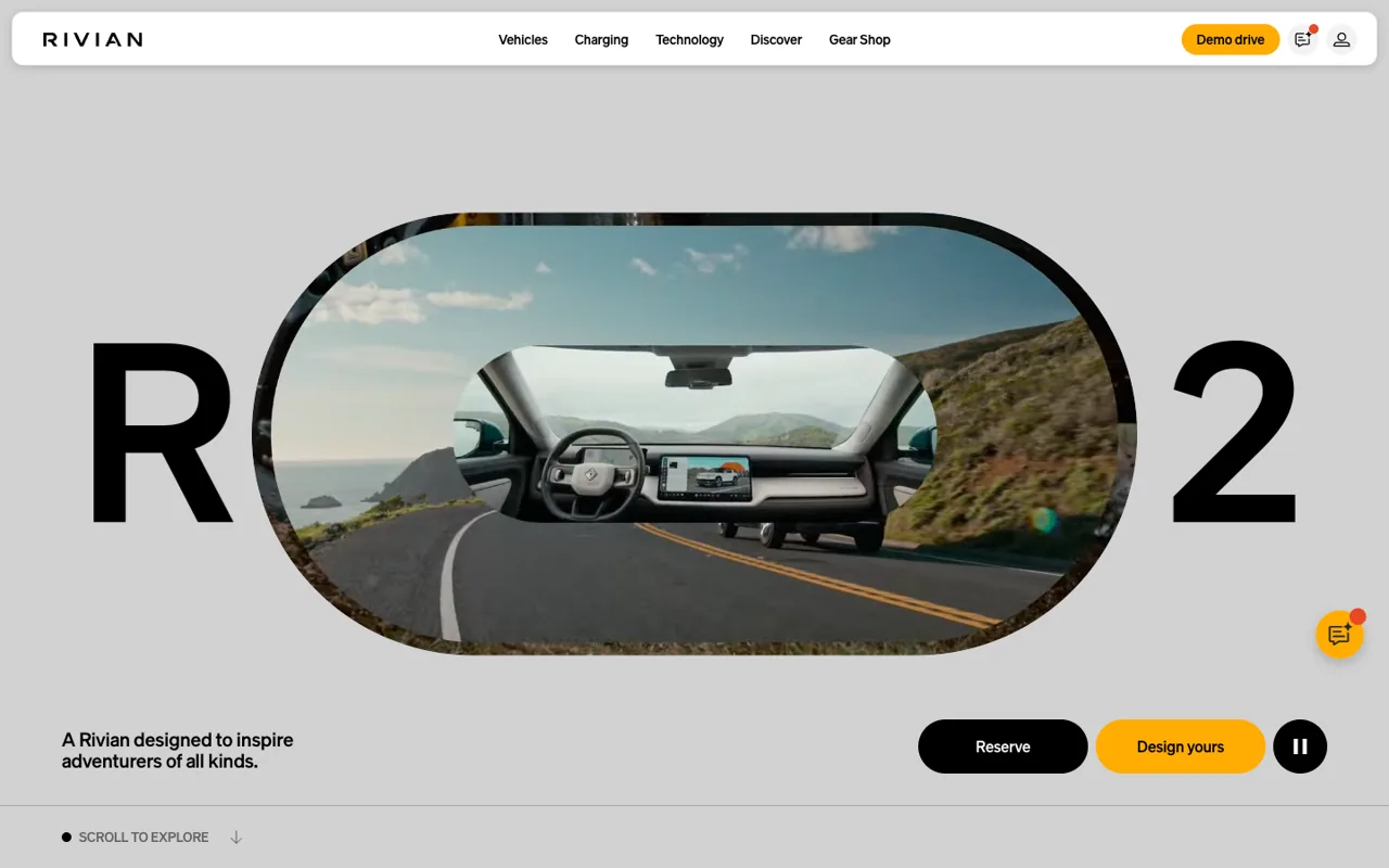
Stack: Next.js · 10.5 MB on load, measured at 22 seconds because the page starts slowly, 53.2 MB over a full scroll · 32.9 screens of scroll · 16 video elements, 6 canvases, 1 sticky element · Agency band for a page like this: $5,000 to $15,000 per page, the 360 visualiser on top
Rivian does what Apple used to. The R2 page runs 2D canvases, 6 on arrival and 11 by the bottom: the setup behind the frame sequences Apple made famous with the 2019 AirPods Pro page, which Apple has since dropped on the pages we measured. Add 16 video elements and a 360 visualiser whose image folders sit in plain sight in the source. Three.js and Lottie both show up in the code too.
The hero is the best opening in this list once it shows up: a giant R and 2, with a pill-shaped window of road footage between them. Getting there takes patience. In our captures the first screen stayed flat grey with “Scroll to explore,” even after 22 seconds. Nothing appears until you scroll.
Steal this: If you scrub frames, show the first one instantly as a plain image and let the canvas take over when it is ready. A grey screen that asks for a scroll loses everyone who does not scroll.
9. Cowboy, e-bike
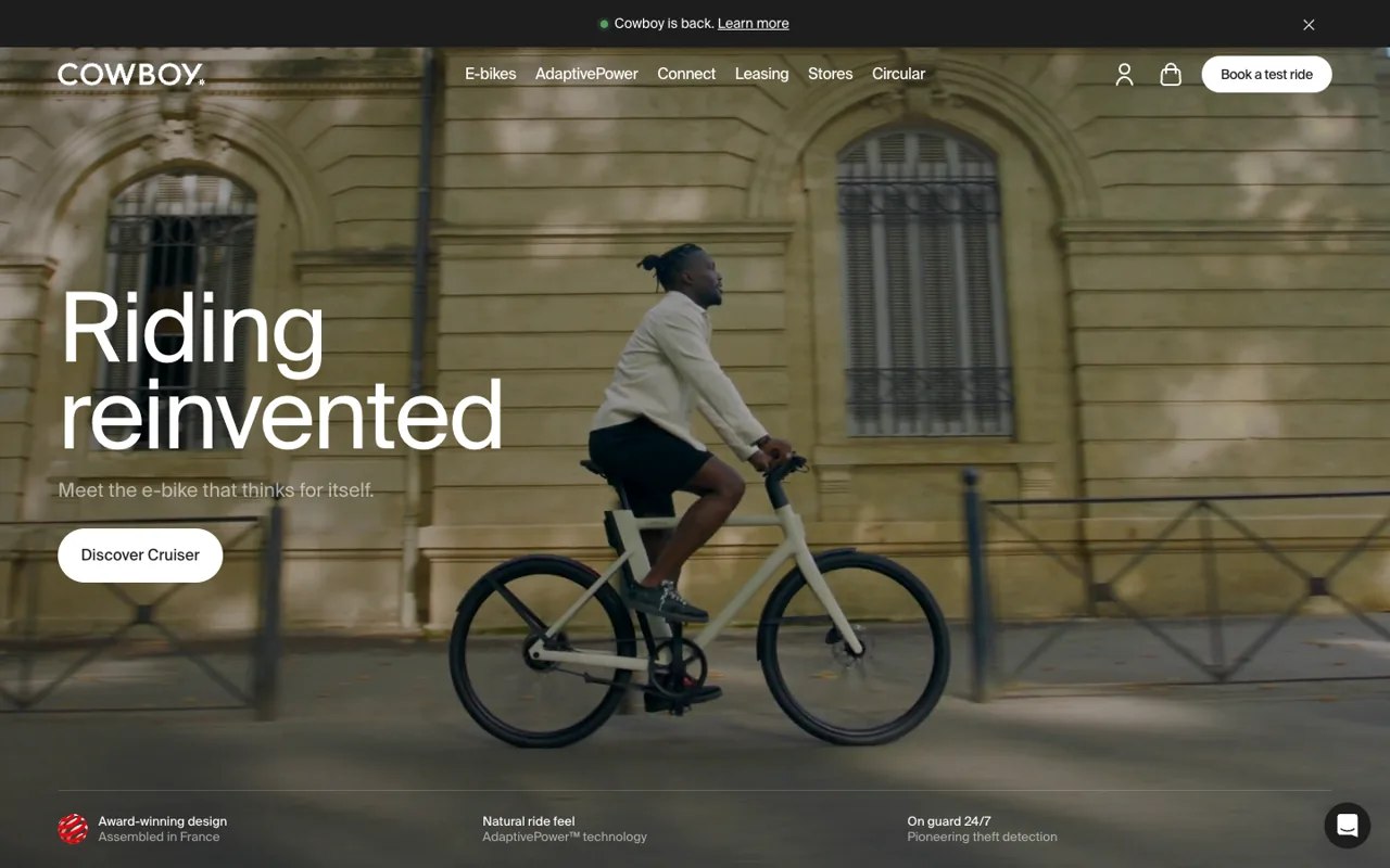
Stack: Shopify · 3.2 MB in the first 8 seconds, 64.4 MB over a full scroll · 20.9 screens of scroll · 11 video elements, 3 sticky elements
Cowboy opens on a rider crossing a sunlit street in one unbroken shot, with “Riding reinvented” set huge on the left. 11 videos across 20.9 screens.
Like Ember it runs on Shopify, which matters more than it sounds. Test-ride booking, leasing and the cart live on the same page as the film, with no handoff to a separate store.
Light at the start, heavy by the end: 3.2 MB in the first eight seconds, 64.4 MB by the bottom, the second-heaviest full scroll in this list. That is lazy loading doing its job. You only pay for the film if you keep watching.
Steal this: Put three proofs in one strip under the hero, the way Cowboy does with award, ride feel and theft protection. It does the job of three sections.
10. Playdate, handheld console

Stack: Three.js · 8.5 MB in the first 8 seconds, 12.0 MB over a full scroll · 17.1 screens of scroll · 2 video elements, 2 canvases · Agency band for a page like this: $20,000 to $50,000+
Playdate's hero is a live Three.js model of the console, yellow on grey, with a game running on its little screen. It runs on two canvases and two videos.
No sticky stage, no scroll film. Personality does the work: big type, a “Season 3” sticker slapped on at an angle, and a whole section built around the crank. Apple's discipline, opposite tone.
Steal this: A real-time model only earns its weight if people can tell it is live. Put something moving on it, like the game on Playdate's screen.
11. Analogue Pocket, handheld console
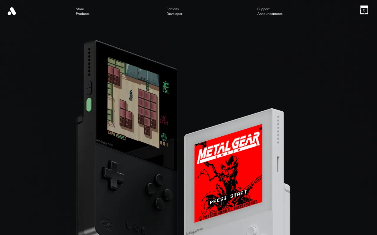
Stack: Next.js · 40.0 MB in the first 8 seconds, 40.0 MB over a full scroll · 29.8 screens of scroll · 1 video element, 2 sticky elements
Analogue Pocket uses Apple's other trick: barely any motion at all. One video, 2 sticky elements, black and white, and product photography so sharp the page reads like a print catalogue. The navigation is six quiet words in three columns.
The catch is in the numbers. 40.0 MB in the first eight seconds, about four times anything else in this list, and then almost nothing more over 29.8 screens. It loads every enormous still up front.
Proof that “no animation” does not mean “fast.”
Steal this: If your photography is this good, let it carry the page. Then compress it properly before launch.
12. Raycast, software
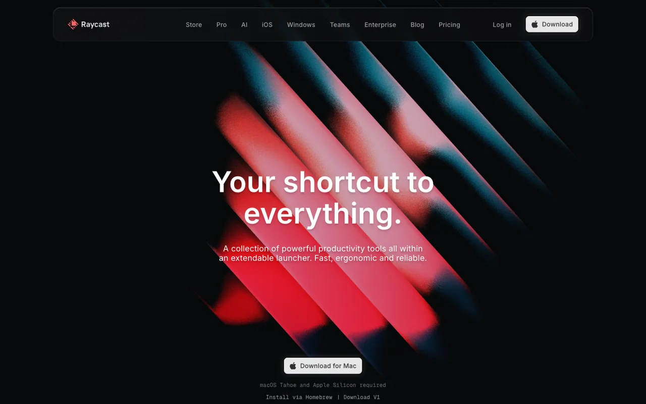
Stack: Next.js · 3.2 MB in the first 8 seconds, 17.4 MB over a full scroll · 17.8 screens of scroll · 1 canvas
Raycast is the software answer to the Apple look. The hero is red and teal light bars on black behind “Your shortcut to everything.” One canvas, drawn at twice its on-screen size, and zero videos. Below it, the product is shown as crisp interface, the way Apple shows macOS.
Raycast is a Mac app, so borrowing Apple's visual language is on purpose: dark glass, one download button with the Apple logo, nothing competing with it.
Software can have an Apple page. The interface is the product shot.
Steal this: If you sell software, render the interface as carefully as Apple renders hardware. One moving thing in the hero is enough.
How Apple actually builds its product pages (measured, not guessed)
The internet's favourite explanation is that Apple draws a few hundred JPEGs onto a canvas and scrubs them with your scroll. That was true of the AirPods Pro page in 2019, and nearly every tutorial since copies it. It is not what Apple ships now, at least on the three Apple product pages we measured. Of the twelve sites above, Rivian is the clearest holdout.
| Apple page, 10 Nov 2026 | Canvases | Video elements | Sticky elements | Before scrolling | Over a full scroll | Screens of scroll |
|---|---|---|---|---|---|---|
| AirPods Pro 3 | 0 | 16 | 12 | 8.7 MB | 19.8 MB | 32.2 |
| Apple Vision Pro | 0 | 26 | 9 | 1.7 MB | 35.6 MB | 36.3 |
| iPhone range page | 0 | 0 | 13 | 2.2 MB | 2.8 MB | 18.0 |
None of the three loads GSAP, Three.js or a smooth-scroll library. Each page loads its own script bundle plus a shared film player whose file is literally called autofilms. Underneath, it is five moves:
- A sticky stage. A section taller than the screen, with a child set to
position: sticky, so the product holds still while you scroll through it. That is the "the page stops and the product turns" feeling. - Scroll as the timeline. Progress through that tall section drives exactly one thing: a video playhead, a frame number, a 3D camera, or plain opacity and scale. One input, one output.
- Video, cut for it. Apple now leans on short videos that play as you arrive. Scrubbing video smoothly needs dense keyframes, which is why most home-made attempts stutter.
- Frame sequences when video will not behave. Numbered stills drawn to a canvas are still the most reliable scrub across browsers. The price is weight: 150 frames at 100 KB is 15 MB before anything else loads.
- Quiet everywhere else. Huge type, one idea per screen, a lot of nothing. The motion reads as expensive only because the rest of the page shuts up.
The part most copies miss is when the weight arrives. Vision Pro moves 35.6 MB over a full scroll but only 1.7 MB before you start scrolling, because each chapter loads as you reach it. AirPods Pro 3 front-loads more, at 8.7 MB. A new product page needs its first screen readable in under 2.5 seconds on a phone, so ship a still first frame and lazy-load every chapter after it.
How to make a website like Apple: the build order
- Write the chapters first. Five to seven beats: the reveal, the one feature that matters, the material or detail shot, the proof, the price. If you cannot write them, no animation will save the page.
- Get the footage or the model. A turntable shoot, a CAD file turned into a GLB, or renders. This is the expensive line, not the code.
- Pick one technique per chapter. Video for motion that already exists, a frame sequence for an exact scrub, real-time 3D only when people need to turn the thing themselves.
- Build the stage. Sticky sections plus one scroll driver. GSAP ScrollTrigger is the common choice; native CSS scroll-driven animations handle simple fades and scales in Chromium browsers and recent Safari.
- Budget the weight. Keep the first screen's media under about 300 KB and load the rest as people arrive. Test on a mid-range Android, not on your MacBook.
- Give mobile its own cut. Shorter sequences, portrait framing, and a still fallback for people who turn motion off.
The long version, with the code-level choices, is in how to make a cinematic website. If people need to spin, configure or customise the product, read 3D product configurator examples first, because that is a different build.
What does a website like Apple cost?
Ranges, not quotes. Apple's pages come from an in-house team with a film budget, so there is no invoice to point at. For everyone else:
| Scope | Typical agency budget | What the money buys |
|---|---|---|
| One Apple-style product page | $5,000 to $15,000 | Five to seven chapters, scroll-played video or a frame sequence, your footage or renders, a mobile cut |
| Full site with real-time 3D | $20,000 to $50,000+ | Several pages, a model people can turn, custom shaders, the whole site as one experience |
| Awwwards-tier production | $60,000 to $150,000+ | An original film shoot, a motion system, a team of four for months |
Footage sits outside every row. A turntable shoot or a set of renders often costs more than the build. Template versions exist for $0 to $3,000 in Framer or Webflow, and they look like templates the moment the product photos come from a phone.
DappaSol builds the first row from $3,000 on our Flagship build, usually 2 to 4 weeks. Real-time 3D sites are scoped per project. Details on the 3D and cinematic service page, and the full breakdown in what a 3D or scroll website costs.
Can you copy Apple's website design?
Copy the technique, not the page. Sticky stages, scroll-played video and big type are patterns, and nobody owns a pattern. Apple's photography, renders, copy and logo are owned, and lifting them is how you get a letter. A page that copies Apple's overall look closely enough to confuse buyers can also draw a trade dress claim. This is not legal advice; if you are close to the line, ask a lawyer.
Designers and agencies: send a client our way and you get 10% of the build fee, paid when the client pays. Say "referral" in the first WhatsApp message and name the client. No form, no partner portal, no minimum.
Keep going
- Best Three.js websites: twelve real-time 3D sites, measured live
- Cinematic website examples: sites that feel like film
- Websites like Igloo Inc: the 3D scroll format, taken apart
- 3D product configurator examples: let people turn the product
- Premium website examples: twelve high-end sites taken apart
- 3D website examples: what the good ones do and what they cost
- Immersive website examples: sites that pull you in
- Scrollytelling examples: sites worth the scroll
- How to make a cinematic website, step by step
- What a 3D or scroll website costs in 2026
- The studios that build this look, ranked with prices
- Our 3D and cinematic build service, with prices
FAQ
What websites are like Apple's?
Sonos Arc Ultra, DJI Osmo Pocket 3 and Ultrahuman come closest right now: sticky chapters, video that loads as you scroll and one product per screen. Samsung's Galaxy S25 Ultra has the most Apple-looking hero, Rivian's R2 page still uses the 2D-canvas setup behind Apple's 2019 frame sequences, and Raycast shows how software borrows the look. Ember, Meta AI glasses, Insta360 X4, Cowboy, Playdate and Analogue Pocket complete the twelve we measured in November 2026.
How do I make a website like Apple?
Write five to seven chapters, get product footage or a 3D model, then build sticky scroll sections where your scroll drives one thing per chapter: a video, an image sequence or a 3D camera. GSAP ScrollTrigger is the common tool. Load everything after the first screen lazily and make a separate mobile cut.
What does Apple use for its website animations?
Its own code. In our 10 November 2026 test of three Apple product pages, Apple loaded its own script bundles and a shared film player, with no GSAP or Three.js. The AirPods Pro 3 page ran 16 video elements, 12 sticky elements and zero canvases. The canvas frame-sequence trick most tutorials teach is Apple's 2019 method.
Can I build a website like Apple in Webflow or Framer?
Partly. Both handle sticky sections, scroll-linked fades and embedded video well, and Webflow has owned GSAP since 2024. Exact frame-by-frame scrubbing and real-time 3D usually need custom code. A template version looks like a template unless the product footage is excellent.
Do Apple-style scroll animations hurt SEO or speed?
They can. Google reads the HTML, not the animation, so keep real text on the page and not baked into images or video. Speed is the bigger risk: Apple's Vision Pro page moved 35.6 MB over a full scroll in our test, but only 1.7 MB before the first scroll. Ship a still first frame, lazy-load later chapters and keep the first screen light.
How much does a website like Apple cost?
A single Apple-style product page typically runs $5,000 to $15,000 at an agency, a full real-time 3D site $20,000 to $50,000 or more, and Awwwards-tier productions start around $60,000. Footage or renders are extra. DappaSol's Flagship builds start at $3,000.
Is it legal to copy Apple's website?
Copying the techniques is fine: sticky sections, scroll video and big type are patterns nobody owns. Copying Apple's photos, renders, copy or logo is not, and a page that copies the overall look closely enough to confuse buyers can draw a trade dress claim. Use your own product and your own words. This is not legal advice.
Have a product, or just a question about this? You don't have to book a call. Message us. Ishan replies within 24 hours.
Something went wrong. WhatsApp us instead?
Got it. If you gave an email, a confirmation is already on its way and Ishan replies within 24 hours.