Maleta. Built to look the price.
Premium luggage can't sit in a store that looks like a discount rack. The storefront had to justify the tag.
The engagement. Storefront design and build for Maleta, a premium luggage D2C brand. Our scope was the store itself: how the product is presented, how the price is justified, and how clean the path to checkout is. The store is live: visit themaleta.com and click around it yourself.
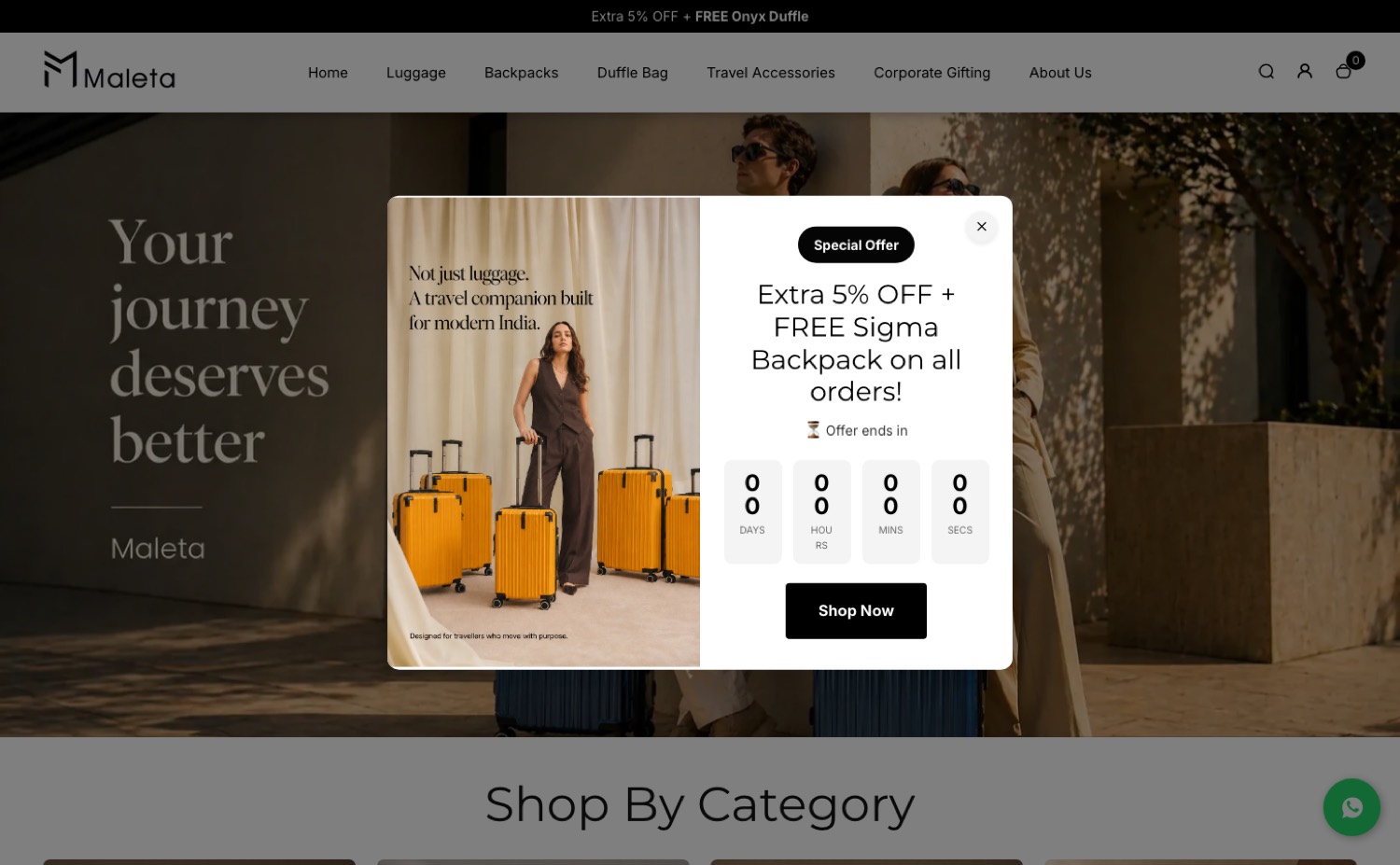
Maleta · storefront
A premium product in a commodity frame.
Luggage online is a race to the discount banner. When a premium brand shows up in the same visual language as the cheap stuff, the customer's eye does the math instantly: same-looking store, higher price, close tab. The product deserved a presentation that carried its build quality before a single spec was read.
A storefront that does the product justice.
We designed and built the Shopify storefront: a hero that treats the luggage like a product shot, product pages that walk through material and detail instead of dumping a spec table, and a purchase path with the friction taken out on mobile, where most of the traffic lives.
The scope was the storefront. We didn't run their ads or their fulfilment, so we won't take credit for anything past the store.
The store finally matches the suitcase.
A live D2C storefront that looks like the price point it sells at. You'll notice there's no "revenue up X%" line here: we didn't measure their revenue, so we don't claim it. What we shipped is on screen, and that we'll stand behind.
How this applies to you
If you sell a premium product through a store that looks like everyone else's, the store is quietly arguing against your price. Fixing the presentation is usually cheaper than discounting your way out of it.
Storefront builds like this are our Shopify / D2C lane, from $1,500. The Week-1 Build Audit is $500 flat, credited against the build.
Your project next
Let's ship yours.
Same senior team, your project next. Tell us what it has to do and a fixed price comes back, usually within a business day. An Overnight Site is $399 and goes live in a day. A flagship build starts at $3,000.